TKL.World Redesign
Categories
Capstone Project
·
Prototype
Year
2026
Duration
120h
Client
-

Introduction
For my final Individual Practical Assignment (IPA) during my apprenticeship as an Interactive Media Designer at ETH Zürich, I redesigned The Kid LAROI’s website.
The focus was on improving usability and structure while creating a more user-centered experience, without losing the essence of the artist. The goal was to enhance the overall user experience and strengthen his identity.
The Previous Design
The previous design of The Kid LAROI’s website had a few clear usability and structure issues. Simple things like finding music, checking tour dates, or navigating the shop were not always easy or intuitive. Different elements sometimes behaved differently, which made it harder to understand where to click or what to expect.
Overall, the layout also felt a bit unclear, especially on mobile. Smaller text and tight spacing made it less comfortable to read and navigate. While the visual style did reflect the artist, the experience itself didn’t fully support what users were trying to do.


Research
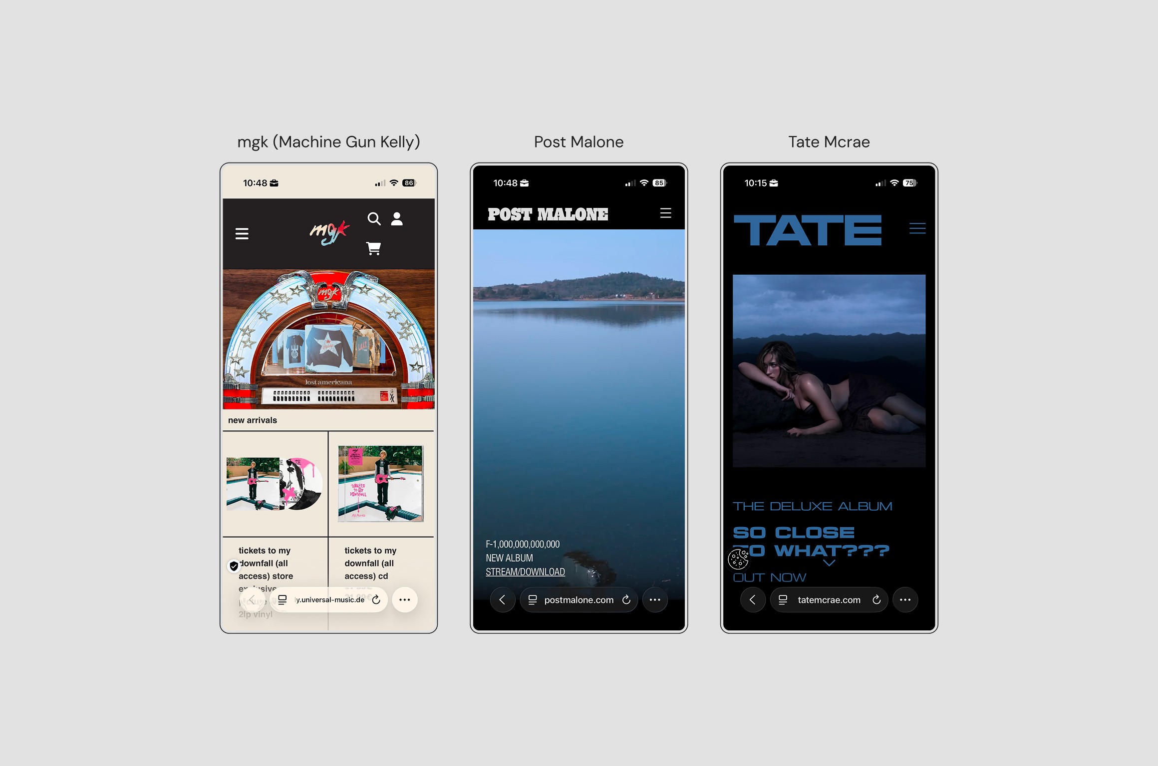
To understand the starting point, I analysed the existing website together with similar artist platforms like Post Malone’s. These showed how a clear structure and strong hierarchy can guide users more effectively through content-heavy pages.
In comparison, The Kid LAROI’s website lacked consistency and clarity in key areas. Important actions were not always easy to find, and the overall navigation felt less intuitive. This defined the main focus of the redesign: improving usability while still keeping the artist’s identity.
To validate these assumptions, I conducted a small user test with a casual listener. The goal was to observe how users interact with the site when completing typical tasks like finding music or exploring tour information.
Wireframes & User Testing
Based on the research, I started by creating low-fidelity wireframes to explore a clearer structure and improve the overall user flow. The goal was to make navigation simpler and bring the most important actions more to the front.
After developing these into high-fidelity designs, I tested the prototype with a hardcore fan. The user was able to move through the site quite intuitively and complete tasks without major issues, which showed that the structure and layout were working well.
The testing still helped uncover smaller details that could be improved and gave me the chance to refine the design further.
Final Design
The final design focuses on clarity, structure, and a more guided user experience. Navigation was simplified, key actions were made more visible, and content was reorganised to feel more intuitive across both mobile and desktop.
At the same time, the visual direction stays true to The Kid LAROI’s identity. The result is a design that not only looks like the artist, but also works better for the user.


Project Takeaways
Looking back, I am very happy with the final result. The project helped me better understand how important structure and consistency are.
For a deeper look into the full process and documentation, you can read the complete project here: Arthur IPA Dokumentation